
Responsive App Design
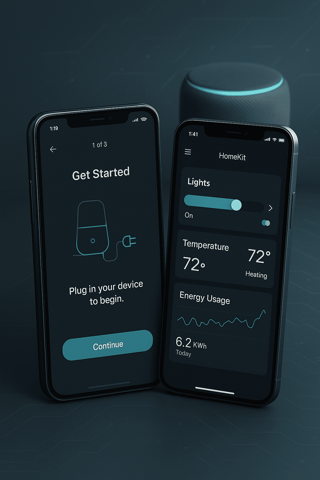
Seamless User Experiences Across All Devices
In an increasingly mobile world, responsive design is no longer optional - it's essential. Users expect your application to work flawlessly on every device, whether on smartphones, tablets, or desktops. Thoughtful responsive design ensures that your app not only looks great but is also intuitively usable, regardless of screen size.
Elasticbrains develops responsive applications that seamlessly adapt to different screen sizes and devices. With a mobile-first approach and cutting-edge frontend technologies, we create apps that delight your users while meeting the highest performance standards.
Mobile-First Approach
We develop for mobile devices first and then progressively enhance for larger screens - for optimal performance across all devices.
Consistent User Experience
Your users experience a uniform and intuitive operation, regardless of which device they use.
High Performance
Optimized loading times and smooth animations through efficient implementation and modern frontend frameworks.
Accessible
We ensure accessibility (WCAG standards) and make sure your app is usable for all users.
Our Responsive Design Solutions
Adaptive Layouts
We develop flexible layouts that intelligently adapt to different screen sizes. Using modern CSS techniques like Flexbox, CSS Grid, and Media Queries, we create interfaces that are optimally displayed on every device.
Touch Optimization
Specially optimized for mobile devices, we enhance touch interactions: sufficiently large tap areas, intuitive gestures, swipe navigation, and tactile feedback ensure natural operation.
Progressive Web Apps (PWA)
We develop Progressive Web Apps that feel like native apps: offline functionality, push notifications, homescreen installation, and seamless performance - without app store downloads.
Cross-Device Testing
Comprehensive testing on real devices and browsers ensures your app works flawlessly everywhere. We test on various screen sizes, operating systems, and browser versions.
Performance Optimization
Fast loading times are crucial for mobile users. We optimize images, minimize code, implement lazy loading, and use modern caching strategies for maximum performance.
Technologies for Responsive Design
Modern Frontend Frameworks
Vue.js, React, or Angular for reactive, performant user interfaces with component-based architecture.
Modern CSS Techniques
Flexbox, CSS Grid, Container Queries, and CSS Custom Properties for flexible, maintainable layouts.
Utility-First CSS
Tailwind CSS for fast, consistent, and responsive design implementation with minimal overhead.
PWA Technologies
Service Workers, Web App Manifest, and modern Web APIs for app-like experiences in the browser.
Testing Tools
BrowserStack, Chrome DevTools, and responsive design testing tools for comprehensive quality assurance.
Performance Monitoring
Lighthouse, WebPageTest, and Core Web Vitals monitoring for continuous performance optimization.
Design Principles
Content First
Content is paramount. We structure the information architecture so that important content is prioritized across all devices.
Flexible Grids
Percentage-based layouts instead of fixed pixel values allow the app to fluidly adapt to any screen size.
Responsive Media
Images and videos automatically adapt and are delivered in optimized sizes to save bandwidth.
Meaningful Breakpoints
We define breakpoints based on content, not devices - for future-proof designs.
Start with Responsive App Design
Our expert team develops responsive applications that delight your users on every device. From initial concept through design to implementation and testing - we guide you through the entire process and ensure your app meets the highest quality standards.